Serge Pronin | ProDesign Studio / Personal
Information
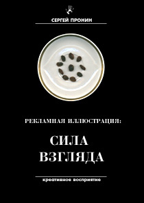
1. źThe Power Of
Sight╗
THE FIRST EDITION
110 P., white/black, 107 pics.
ÓprilŚmay 2001. Saransk.
ISBN 5-93966-002-9
Serge Pronin ę
YOU MAY READ BOOK:
RUSSIAN STATE LIBRARY
[FB] 201-31/284-4, [FB] 201-31/283-6
Reg. ╣ 01-33778 RKP
Annotation.
The book of Sergey Pronin is very interesting and professionally written. It will be of big help for the advertising and other mass media specialists, especially for the artists and visualizers. Which are its main advantages:
1. The book is about the most important trend in post-modern communication - its visualization (iconization);
2. The book deals with some of the most advanced tendencies in the vizualization - namely the vizualization of
advertising - the most dynamically developing mass media genre;
3. Mister Pronin has deep knowledge in this field - the reasons are that he
knows the most important researches in the
field and that he is at the same time excellent computer vizualizer.
4. It is very rarely that an artist can write scientific book. Maybe it is
typical Russian phenomenon bearing in mind that Russian scientists are among the best in the world.
5. Additional advantage is that Sergey is a student - e.g. he created remarkable images and also this book at the age of 21-22. That means that he has a big potential in the future.
6. Another advantage of the book that it is highly vizualize with the original works of Sergey, but also with some ofthe best world ads.
There are a lot of other advantages, but as a general conclusion this book will be of practical help for the respectivespecialists.
Because of this and other reasons I recommend without any hesitation the book ofmister Pronin and I am firmly convinced that he must continue with doctoral thesis.
--
Associate professor Christo Kaftandjiev, Ph.D.
How to Learn to View the World Differently in a Half an Hour
(The Book: źPublicity Illustration:
the Power of Sight╗)
Translated by Natalya Zelikova ę.
Thank you, Natalya!!! Ś S.P.
You may put on rose-colored glasses. Or you may just close your eyes. Everyone has encountered people who, in their own words, "can't invent anything," "have no imagination," and so on. The funny thing is that they all do have these abilities. They simply DON'T WANT to use them. I have come to the conclusion that the trouble with these people lies first and foremost within themselves. They think a person is born with such skill - "to be able to think creatively". Although no one ever thinks that it is essentially easier when vision comes to the aid of thought. Surely you may roll your eyes, collapse on the sofa for a couple of days, drink up a year's supply of coffee during this time, but this hardly helps, take my word for it.
I recall a seminar in Golitsyno. There was a dinner party in the evening, the table was laden with food and tableware. A prospective commercial designer was sitting next to me. We were talking about perceiving one's environment creatively. She also thought that she didn't have any imagination. At random, I took a spoon and a rose from a vase on the table and asked her to unite these two seemingly incompatible items into some unique entity. Spoon and rose, rose and spoonů She looked puzzled. Incomprehensible? Well, then let's take them one by one. I started to think aloud: a rose is alive and a spoon is not. A spoon is made of steel and a rose is not (otherwise it wouldn't be alive!). Let's change their features. What comes of it? A steel rose and a live spoonů This is getting interesting. Let's go on. A rose grows and a spoon doesn't. But a spoon can be a teaspoon, a dessert spoon, a tablespoon, even a ladle! Doesn't this resemble something? Periods of aging perhaps? The spoon grows! What does this mean? A growing appetite? Maybe. Or maybe it means we've gone crazy. Anyway this becomes interesting; this is already something we can proceed working on. Why is this interesting? Have you ever seen a living spoon? Me neither . But we invented one! Stop, we forgot another component - the steel rose. A rose has thorns. And what about the steel rose? You're right, steel thorns. And what else has steel thorns? Steel barbed wire might be an option. Steel barbed wire as a stalk of a steel rose? That is also a theme, but a completely different one. Two items, two directions. She looked truly happy, seeing this I understood that she still didn't grasp how to operate using such comparisons. I decided to go on with our unique training.
This time a bottle and an orange were near at hand. "Let us say that we advertise orange juice and we have to employ these two objects . What shall we do?" She proposed to put the orange on the bottleneck. "Is that interesting? Not really. But what about a bottle-shaped orange? A bottle wearing an orange-peel?" That's something fresh. We can stop at that point, or go beyond it. Here we can apply the same comparative method. How do you peel an orange? From my personal observation, many people peel an orange so that the peel looks like a daisy. This is a familiar image for everyone, so it will do. Go on developing the idea.
What will the bottle look like without the peel? A "peeled" bottle. Glass that looks like a stripped off daisy-shaped orange peel. And what will play the part of the bottle contents? Surely, the fruit itself: with streaks and sections, with all those details that a normal fruit has, but bottle-shaped fruit. To perfect the composition, we can leave aside a piece of peel with a "pimple" on it symbolizing a removed bottle cap. I think we have succeeded in conveying the juice's naturalness in a sufficiently attractive way.
While we were talking, the designer put a wineglass in a way that the lamplight going through it created almost perfect image of a window on the tablecloth. I asked her to look at the light and shade. She concentrated her attention on the interesting picture that these two had created. I asked her the next question: "Don't you think this looks very much like a window?" Her eyes widened, she turned her gaze to me for a second and then started to inspect the play of light and dark with fiery eyes. I heard a whoop of joy: "You're right, a window!" Soon she herself compared a net of flickering lamps on the ceiling with a golden net for a golden fish. Then other comparisons came to her mind, one after another. And that was progress. I can say that this person got a feel for a whole new world view in half an hour. Her further ability to think "creatively" depends on herself. She will succeed in this as long as she herself wants to make progress.
It is very important for a designer to learn how to notice something interesting, strange and unreal. There is often a widespread problem with this. For example, when I asked her to find similarities, she was afraid that I wouldn't accept her ideas as bright and worthy. Fear is one of the strongest feelings of humans, including designers. And this is a fact worth dealing with. The moment a designer begins to think independently, a panicked fear arises of some invisible critic who is sure to drag his name through the mire. Remember: do not ever be afraid of that someone somehow for some reason will consider your idea as dull and silly. You are learning, I am learning, everyone is learning and will always be doing so. There is nothing to be ashamed of. This measures your professional growth. The notion that an idea should always be polished to the utmost is a different matter. In fact nobody asks you to create a mock-up in half an hour. Take criticism not as something terrible, but as a means for analyzing possible inaccuracies and faults. Neither compliments nor criticism should be taken too seriously, as everything is relative; use them for your own enrichment. Those who laughed at your ideas yesterday may silently and jealously follow your success tomorrow, as this has happened to me. The mind should be assured and daring. These are some of its main qualities, and it will be lost without them.
Take a piece of paper and draw up a table if you like, write down similarities, contrasts, mark and draw a sketch of everything that relates to an O.A. (object of advertising) and everything which is somehow analogous or opposite to it. Try to notice as many various features and characteristics as possible; pick up any information related to O.A. Ask yourself questions: What is an A.I.? What are its functions? What does it resemble? etc. You'll see your paper filling up with a web of letters and drawings, image and text analogues of your thoughts. At the first stage even you will notice that most of them are just dull completely unappealing ideas. But that is why we make drafts - to create well-rounded pieces of work. Probably you'll exhaust more than one notepad in your search of a new idea. Don't think that it's an easy process. But it is not always hardů Learn to look at the world differently from everyone else.
Serge Pronin | ProDesign Moscow
E-mail: sergey@prodesign.ru
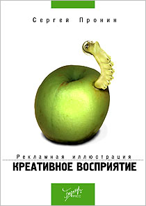
1. źPublicity Illustration:
Creative Perception
(before: The Power Of Sight)╗
THE SECOND EDITION
142 P., colour.
October 2002. Moscow.
Berator Press Publishing
ISBN 5-9531-0016-7
Serge Pronin ę
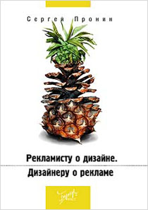
2. źTo Advertiser About Design.
To Designer About Advertising╗
165 P., colour.
October 2004. Moscow.
Berator Publishing
ISBN 5-9531-0030-2
Serge Pronin ę
ę Serge Pronin.